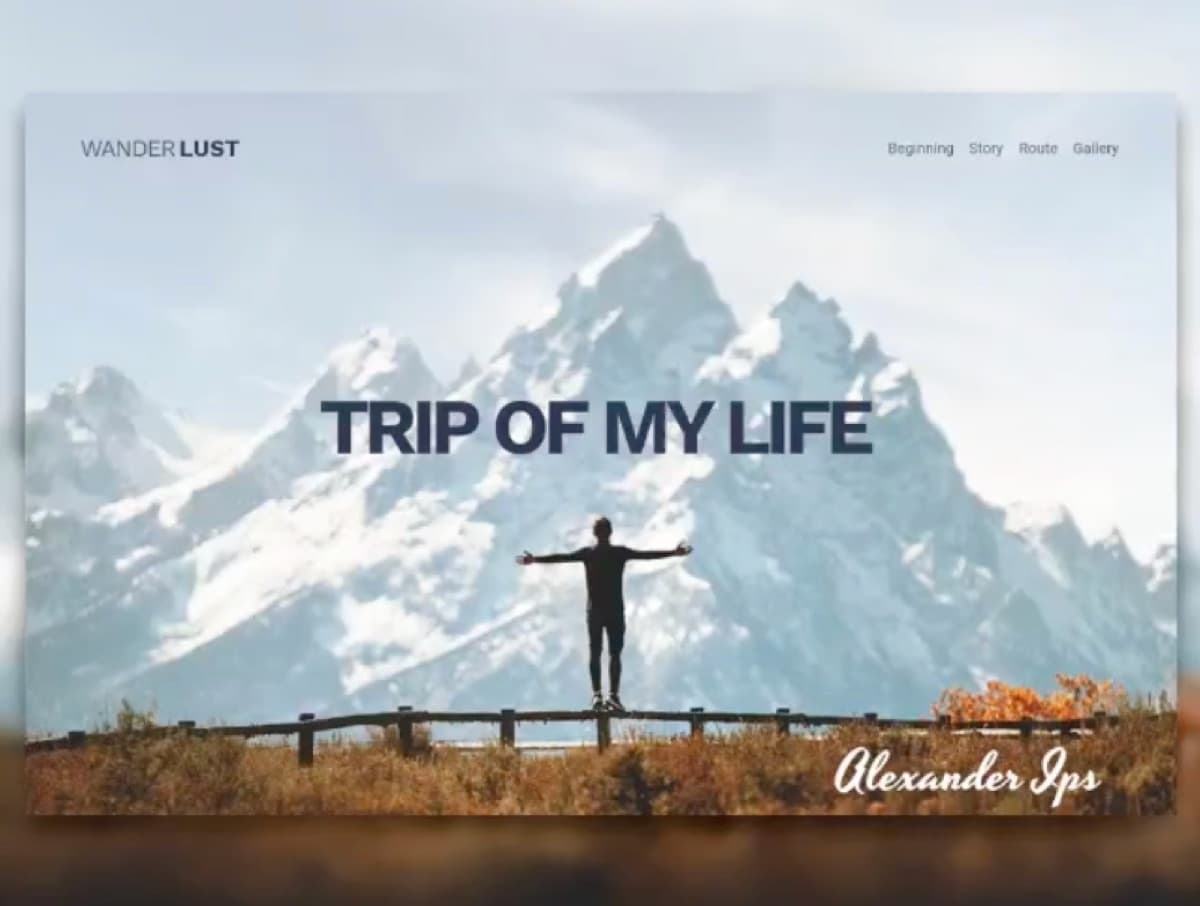
hartmann design needed a distinctive travel and lifestyle visual language that could stretch across campaigns without feeling generic.
visual identity exploration and campaign-ready design that gave the team a repeatable language for travel and lifestyle positioning.
the work was strong in pieces but had no shared system. every new brief started from scratch.
a coherent design system the studio can deploy across campaigns without losing personality, and far less time lost starting each brief from zero.